PRODUCING PROFESSIONAL MATERIAL
- Oct 18, 2017
- 5 min read
Professional material is a way of promoting yourself or your business to another company, future employers and your audience. Professional material is all about promotion to others to help bring you more opportunities or job offers as they show the audience and future employers what you do and how you put yourself forward to others. Some well known kinds of professional materials are business cards which allows you to give people your contacts when speaking to others about your career or to pass on to businesses. Another form of professional material is your CV which holds all of your experience to pass to others for job interviews which can help you have a better chance in getting the job. Finally, another example are websites which can be used a portfolio to hold information such as contacts and your work to show to an audience or future employers.

When developing my business cards, I wanted a colour scheme that would look professional but was creative and unique. I decided on the logo design being blue, green and red to be unique and to also make the logo look like a lens on the camera to produce imagery for the audience. I decided on the main basis colours of black and white as these two colours are seen as professional and clean, making the audience see my business cards as professional and to increase the chances of work. On the back I decided to put an image of myself with a camera to show the audience what I do without having to read the information on the other side of the business card. I kept in mind the examples that I analysed and how they made different elements to result in the best quality business cards they could produce. I then went to Vista Print and put in my design, moving any parts that didn't stand out enough, until I was happy with the result.

Designing a website is another form of professional material that can be used to promote yourself to an audience. I already had a website but started a new one to make it more aesthetically pleasing to those that come across it and much easier to navigate. I stuck with the colour scheme that I used on my business card and made some of my images black and white to fit to this scheme. The black and white images made it easier to add suitable text onto the images and overall made the website look much more professional. I used the same image as on my business card to connect the two when someone uses my business card to find my website.

I also put in contact information so they can contact me through easier devices such as via email rather than having to call me when they're free and can help plan in advance. This is also best suited for those that don't have my business card and allows them to still contact me without having any information on the business card. I kept the contact page to the colour scheme of the rest of the website but made the text easy to read so there is no confusion for the person trying to contact me and will be able to read what they are writing before sending it to me. At the bottom of the contact page I have put a link to my old website that holds all of my work from the past year so people can view those separately although they are also used on my new website.

The idea of my website is to work as a portfolio to show to future employees, customers, business partners and companies to present my work in an orderly fashion. I put up information about myself and my experience in the work of film and TV so people can get to know me more and what kind of work I do before contacting me to arrange anything such as recording a video. This means that they can check what I have done and to see if it fits to the quality level that they want for the video or if I possibly fit for their business or have skills that as a group of film makers that they may be lacking, allowing opportunities to be hired in the future.

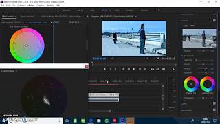
One of the best forms of professional material to promote yourself to an audience when you are a film maker, photographer or actor is a show reel that compiles your best shots from multiple projects. When designing and editing my own show reel I knew that I had to make the edits quick and cinematic. I scanned through all of my videos, finding the best shots from each and putting them onto the timeline. I made my show reel a minute long so the audience can see lots of my work but not get bored and feel like the video has been dragged on for too long. I used shots from all of my videos such as my music videos, Energy and Something Like This, to experimental shots such as lens whacking. I used a range of videos to show that I am capable of producing high quality videos in different genres in the film industry. A show reel is a good form of professional material for those in the creative industry as it can be accessed digitally by the employer and they can see your work whilst reading your CV.
After looking at other show reels, I made my own by taking some elements that I liked from those that I had already seen. I first found the music and then worked my way up to the clips and editing. My show reel is a way of expressing all of the work that I have done to a future employer in an aesthetic way so they can see what work I am capable of and whether my style would fit into their company or work well for a project that they are trying to complete and compile people together for. My show reel is more in the style for a film maker or photographer as that is what I would like to go into in the future, companies seeing what I am focused around and can hire me for jobs that surround my area or to give a role similar to what I have selected where I can perform well.
"Well done Kerrie , looks fab, love the way you combined the work you have done so far , it shows that your skills have improved , flawless editing work , great choice of music flows well with the clips , keep it up"- Frank Sloper
"You have done so well it amazes me how far you have come keep up the good work we r all proud of you xx"- Natasha Sloper
"I like the music and the way the pictures flow together it gets the message across of the variety of work you have some so far"- Helen Sloper
"Really good Kerrie it is a very effective way of showing your work so far and the skills you have learnt along the way and new or improved skills in this video"- Carly Howlett










Comments