
CONTEXT AND CHARACTERISTIC RESEARCH ESSAY ON LIVE SHOWS
- Nov 22, 2017
- 11 min read
For this project we were presented with creating a live show that is approximately fifteen minutes long, my group deciding on creating a quiz/panel show with multiple rounds to entertain the audience of 15 years old and up, following the distinctive age restrictions of 15+ rated films with two teams of two. We wish to make it have a modern set up but with a 80's colour theme, choosing the colour scheme of blue, brown and orange overall to create this style and having the questions based on TV shows and films. When delving into research to find out what was similar to what we wanted to create, we split and analysed TV panel shows and YouTube panel shows as we are trying to style the video to YouTube standards.
To discover what kind of panel or quiz shows already exist on YouTube, we went ahead and found some shows that already exist on YouTube that aren't also aired on TV meaning that they are specific to YouTube. We wanted to research into these shows to show what they had similar in their techniques and styles and what they do differently to each other and how they are presented differently to the audience compared to TV shows.

On The Spot by Rooster Teeth was one of the first shows we looked at that was based only on YouTube, also being live streamed similarly to how we will be doing our own TV show and has the duration of 25 to 30 minutes long each episode, being aimed at 18 years and older as some of the topics they discuss is inappropriate for the younger audience. This show has a similar layout in setting that we wish to create, having a table for the main host with a TV screen behind them. Although in 'On The Spot' they don't have tables for the guests like we want to create for ours, the layout of the guests and the hosts work well. In this show they need to stand up to do forfeits for different sections of the show, this layout giving the availability that we won't need for our own show but shows that they have planned their layout in advance. They also gain input from the audience for some of the questions, keeping the audience involved in the show and could be something that we implement into our own show to keep our audience entertained and feeling involved in the show.

Another thing they do is have motifs on the desk, something that we want to re-create in our own, a few of the motifs being a mug with the logo on and a statue that is given to the winners of the game overall. These are some ideas that we will have to discuss but work well for the show that they are creating, keeping the show looking casual to the audience and for the guests that participate on the show. Many of the topics discussed in this show are based around the internet or TV and film, keeping it relatively similar to something that we wish to create for our own show and the scores are shown on the screen, being an overlay on top of the actual footage and an easy way to keep score. Another thing that we enjoyed as a group was the introduction of the show, the colours and style being similar to what we want to create and could influence our overall design of our own introduction. It is colourful and well edited, the design working well for a 70's styled show and would work for the title of the show. They use a colour scheme of blue which is used in the introduction sequence and throughout the whole show.

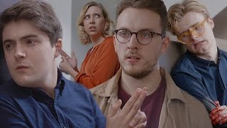
'You Posted That?' is a new quiz show released by the infamous YouTubers, Smosh, that is based around the internet and the guests that they have on the show, the guests having to figure out who tweeted the images they show on a TV screen. This is something that we could easy re-create for our own show, having the TV screen as the main working mechanism of the questions and the footage. We wish to create swede versions of a certain amount of selected films for a round on our show, the TV screen being a professional way to present it to the guests. Smosh also have one host, similar to 'On The Spot' but has three guests that are next to each other. The layout of this show differs to 'On The Spot' by having the host diagonal from the three guests with the TV screen in between them, host and guests having podiums to stand behind. This show has a high budget and wouldn't be possible for our own show but is something that we could take influence from in deciding the layout of our show, having to differing layouts that would both work well for a quiz show. Their target audience is aimed at the audience of 14 year olds and older, the set being vibrant and attractive to the younger audience but the topics they discuss being for the older audience of 18 years old. Smosh holds a weird balance in their show and can be determined differently depending on the topics in the show.
'Male 13-17, Female 13-17 and Male 18-24.'- Yahoo answers

Something that they do differently from most of the shows analysed is that they use music as comedy, a man sat just off screen with a piano. This technique is used to make the audience laugh and to keep them entertained, having something varying from the show to look forward to as the songs are made up on the spot. Although our show is a comedy, we won't be using music for comedic relief as it doesn't fit with the style we want to create but is still a good idea to keep in mind. From looking at this show we could see that all of the shows analysed have different rounds of questions, keeping the show different and unique to keep the audience's interest in the show but still having some familiar knowledge with some of the rounds shown to them. It is a hard balance to maintain and is something that we will have to plan out in great detail, having to look into our audience and understand what they are interested in. A thing that they do similarly to Rooster Teeth is that they use blue lighting, blue being a reoccurring theme for many of the shows we looked at which is important for us as we wish to use blue as part of our colour scheme, us being able to see different ways of keeping the colour scheme throughout the show.

'I can't Even' was a show that was presented by the YouTuber known as Crabstickz, his real name being Chris Kendall, being well known for a secondary panel show he did for comedy week. On his show he invites six guests and splits them into two teams of three, the guests sitting behind desks similar to the hosts but the host table having the logo on the front his desk. This is the most fitting to the layout that we want for our own TV show as we believe that it would work the best with the location that we are filming with and for the overall design of the show. Chirs' show is made on a cheaper budget, the show still having a good use of lighting that will turn on when he introduces the guests, revealing them to the audience. This is a technique many shows use to create suspense and could be easily achievable for our own show, a technique that we could use to unveil the guests to the audience in a fun and interesting way. The scores are shown similar to 'On The Spot', the scores being overlayed onto the footage and could also be easily achievable and professional for our own, a technique we will keep in mind whilst creating the show. He aims his content for the target audience of 12 to 18 year olds, this panel show being for that age range for similar reasons to Smosh, trying to reach a wider audience than many other panel shows.

Similarly to the first the show uses blue lighting behind the guest, making the background darker for the guests to stand out against it. This seems to be a technique used by the shows analysed and makes the show look fun or professional in different uses, being a technique that we could use for our own TV show for these reasons. Like 'On The Spot' they have motifs on their desks that relate to the show, the background of shelves also having motifs that work with the set and the whole tone of the show, being a clever technique to present this to the audience. The introduction is drawn out and animated, showing that a lot of work went into the introduction but was kept short. This introduction wouldn't be used for our own show but works with the tone and overall style that Chris created for his show, working well and complimenting the topics that they were quizzed on, many of the topics being based on TV and Film in the Geek Week episode.

Finally we analysed 'The Crew' by Style haul which is more of a casual talk show but would implement well into our show, us wanting to have discussions in between the rounds to break up the show into clear sections that the audience can understand. Style haul uses four hosts but no guests, having a live audience sat behind the hosts as they discuss recent topics. They have a TV in the background with the logo on which is also seen in 'On The Spot' and 'You Posted That?' by Rooster Teeth and Smosh. The layout is also similar, having the four hosts sat across from each other where the other shows would have guests rather than hosts. This layout works for the show, having the four host visible at all times to the live audience and the camera but wouldn't work for our own show as we only have one host. The use of blue lighting is also used in this show to make the hosts stand out from the audience behind them, keeping your eyes focused on the hosts and not wandering to the background. This show is aimed for 12 to 16 year olds, this being the hosts target audiences on their own channels, the topics they speak about being appealing to the audience of that age and you can see all the guests in the show, all of them being around this age.

Like the three other shows I have analysed they also have a short introduction but have a small preview of what is to come on the show beforehand, showing that the show is live with the audience but pre-recorded before posted to YouTube. The overall introduction is slick and professional but wouldn't work in the style of a 70's show, although a good introduction we wouldn't be able to use anything too similar to this introduction as it would take the style away.The hosts interact with the audience, keeping that connection similarly to 'On The Spot' to gather questions and topics to discuss between each other. They have different topics each week, keeping the audience interested in the show and knowing that there won't be repetition between the different episodes that they produce, each episode being 10 minutes long at the maximum. This fits more with the length that we need to create for our own, being able to see how many topics you can fit in within the time length and what would need to be managed to keep it to schedule. They also use pre-recorded footage of them going out and speaking to people, another technique that we will be using and being able to see how they use this footage to fill in the time.

Shooting Stars is a comedy based TV Panel/quiz show which wasn't hosted on YouTube but follows similar rules to those that are specific to YouTube. I wanted to analyse a TV show to see the differences and similarities between the two different media platforms. Similarities between YouTube shows and this TV show is that they use bright colours, the main colour being blue likewise to the other shows analysed and uses bright colours in a 70's style. This is the most important for us to look at when creating our own show, being able to gain a feeling of the 70's colours and how we can use them to the best affect. They have names on the tables of the guests, similar to 'You Posted That?' by Smosh, and introduces the guests to the audience watching just like the other shows analysed. This is something that is used in many shows and will have to be implemented into our own to stick to the context and characteristics of TV shows. Another thing that they do that is similar is the layout, having two teams of three and one host with each having their own desk, fitting to the layout design we wish to follow and being similar to those based only on YouTube, showing that there is many similarities between the two. This show is for the older audience, the comedy being aimed for 20 years old and up as some of the comedic value comes with the age of the show, needing an understanding of the topics that they discuss and get quizzed on.

Unlike to the YouTube shows, this one has a longer opening sequence which is animated, showing a high budget profit was used for the show and the set design. The introduction is something that we wouldn't be able to re-create or do something similar to in our own show as it requires a higher budget than what we have and much more effort regarding the time we have. The whole show is a lot longer than many of the YouTube shows and the different sections can drag although it follows structure throughout. The colours used throughout the show fit more to the style of what we wish to create and the layout is similar to what we want, having desks for the guests and the host with motifs, but isn't similar in the design that we want for our own. We will look back to this show for influences in the comedic value that we wish to represent in our own but not for the design for the reasons above.
There were many similarities between the YouTube shows that I analysed, all of them using similar techniques or styles. Blue lighting is the first, all of the shows using blue lighting to make the hosts and guests stand out from the background so the audience's eyes are focused on them throughout the show. They all have quick introduction sequences before the host introduces the guests to the audience, keeping it short to keep the audience's attention on the show and not to take up to much space with the introduction that could be used for another round or different content. Motifs on tables and multiple rounds was also two other similarities I could draw between the shows, keeping the structure of the show planned out and to the topics that they are speaking about, many having the logo on them to keep it under their chosen style. But along with this I could see that the TV show, 'Shooting Stars' followed many of the patterns such as using blue in their colour scheme, the layout of the set and the motifs on the desks, showing that there isn't too many differences between the two. All the hosts were also all male, a small but not necessary observation for our own show although interesting to see as it shows that there are less women presenters then male, more of the successful comedy panels having male presenters.
References
YouTube. (2017). I Can't Even: Geek week Special!. [online] Available at: https://www.youtube.com/watch?v=AQy-834HY3M [Accessed 29 Nov. 2017].
YouTube. (2017). MatPat, Gabbie Hanna, and Ricky Dillon | You Posted That?. [online] Available at: https://www.youtube.com/watch?v=QDkLaDDJhG8 [Accessed 29 Nov. 2017].
YouTube. (2017). On The Spot: Ep. 115 - Michael and Lindsay Do Goo | Rooster Teeth. [online] Available at: https://www.youtube.com/watch?v=KzFjHiXPhUg&t=30s [Accessed 29 Nov. 2017].
YouTube. (2017). THE CREW - Episode 1 - Relationships. [online] Available at: https://www.youtube.com/watch?v=v5FMeWSvM3M [Accessed 29 Nov. 2017].
Answers.yahoo.com. (2017). What is the target audience for Smosh on YouTube?. [online] Available at: https://answers.yahoo.com/question/index?qid=20120521172234AAuhnST [Accessed 29 Nov. 2017].


Comments