
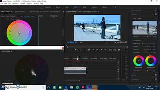
COLOUR THEORY (RESEARCH)
- Mar 5, 2018
- 5 min read
Colours are effective in telling the audience the setting of the scene or the colours connecting to the characters. Colour also can be used to make someone stand out from the scene around them or make them blend perfectly into their surroundings. In film there is a few different combinations used off of the colour wheel to announce different tones or moods to the audience watching.
Complementary colours sit on opposite sides of the colour wheel as they compliment each other and is the most commonly used in film, a common example being blues and oranges that contrast each other well. This technique matches a cool colour such as blue with a warmer colour, orange, to make the contrast strong and vibrant to the visual eye of the audience, allowing the colours to impact them stronger than any other combination. Some of the most popular examples of this can be seen in 'Fight Club' or 'Drive' but can also be seen in the new Blade Runner '2049', being the colour scheme that is mostly found in block buster films.

This colour scheme is normally used when the director wants to show conflict, two colours that compliment each other meeting across the space to show the different sides and to influence the audience to see which is the good and the bad. This is evident in this scene from 'Blade Runner 2049' where the two colours are complimenting each other, creating a vibrant constant. This scene also uses a third colour to make the characters pop out from the background but works alongside with the other two colours, working as an accent to the two main colours shown in the scene.
'Analogous colors are easy to take advantage of in landscapes and exteriors as they are often found in nature. Often one color can be chosen to dominate, a second to support, and a third along with blacks, whites and grey tones to accent.'- Cinema 5d (2018)

Analogous colours sit next to each other in the colour scheme, matching well and creating an overall harmony without making anything of the image pop from the background. The colours are normally warmer colours or cooler colours such as brown or grey to make it have less contrast and tension of the complementary colours. This can be seen in films such as 'The World's End' by Edgar Wright and in many of the films of the 'Fast and Furious' series, using the colours to make the landscape blend but using other colours to accent them and to help the characters stand out from the background.
Triadic colours are sat evenly spaced from the other colours, one being more dominant and the two others being used as accents to the main colour. This choice of colours makes the scene more vibrant as the colours stand out against each other and don't blend together, making a different kind of feel to the other colour schemes that can be used. This colour scheme can also be seen being used on rare occasions where two colours are more dominant and one accents the frame, a good example of this being 'A woman is a woman.'

'A woman is a woman' has the two main characters wearing colours that sit across from each other, making both of them stand out from the background. The red on the dress is more dominant than the blue on the man's suit, making her pop out more than the male but work well together to create a different kind of feel and to accent the scene around them correctly. This is a rare occasion where the two colours are more dominant, the background being a colour to accent the characters and to make them stand out from the background, adding a level of depth to the shot that may of been missed with any other colour scheme, making it unique and different.

Split complimentary has two colours sat next to each other and the one directly across to them, creating a triangle shape on the colour wheel. This colour scheme works similarly to complimentary colours, sharing the same high contrast but has less tension in the shot. Some of the more popular colour choices for this are teal, green and red which make the background blend in or pop out as needed against the characters in the shot. This is visible in 'Burn after reading', using the red to make the characters pop from the background and the bottle being a brighter colour to contrast it.
'A split-complimentary color scheme is really very similar to complimentary colors but instead of using the direct opposite color of the base color, it uses the two colors next to the opposite.' Cinema 5d (2018)
Tetradic colours consist of four colors arranged into two complementary pairs, allowing the colour scheme to be wide to allow variety in the shots. Although this scheme allows a wide selection of colours to be used, creating a full pallet of colours to be used, one colour is normally still dominant to the others and the others are used to create a strong contrast against the main colour.

One example of this is the balloons in 'Up', the multiple colours allowing a wide pallet of colours to be used but in this particular scene blue dominates the scene. The colours are used to compliment each other and to make the scene vibrant, expressing happiness and innocence to the audience as there are multiple colours being used, creating a child-like feel to the scene presented to the audience. This colour scheme is rarely used in film as it is hard to present correctly, being easier to represent through animation similar to 'Up'.
Finally we have the monochromatic colour scheme which is the least common chosen in films, being one of the hardest to perform correctly and to represent in film. Monochromatic colours are all rarely used but is when a shot uses one colour off the wheel in different hues and contrasts. The most common cause of this is blues and browns to create a colour that pops which can either make the character blend into the background or stand out.

A good example of this can be seen in the Matrix, the main colour consistently throughout the film being green and can be found in all of the scenes. The scenes use different contrasts and hues of green to create a differentiation throughout the background and uses black for the costumes, allowing the characters to stand out from the background whilst also complimenting it. It is a technique that can be hard to use but allows you to have a wider range on whether you want to allow the characters to pop for the background or whether to allow them to blend in, the Matrix performing both throughout the film but uses other colours to help compliment the green and to keep the consistency of using the colour.
Colour is an effective tool in creativity and setting a tone, drawing the audience's attention to a certain character or to feel a certain emotion. It is important to understand colour to know how to implement it correctly to make the World feel real to the audience and to adjust their emotions. Being able to use colour effectively will make the scene memorable to the audience and be powerful, altering their emotions if implemented correctly.
References
Cinema5d.com. (2018). [online] Available at: https://www.cinema5d.com/film-color-schemes-cinematic-color-design/ [Accessed 15 Jan. 2018].


Comments